This is a guest post. Inkjet Wholesale’s Office Hacks Blog welcomes all types of contributions from content writers, SEO experts, and online entrepreneurs provided the content meets our editorial guidelines. If you would like to contribute to this blog, please feel free to contact us!
 Pictures, drawings, and an illustration are used to communicate ideas or pass on an important message to people. The colour, on the other hand, is a crucial component when you want people to look at your picture or drawing. Colours have a way of calling on people to look at them; it’s like they say, ‘hey there look at me.’
Businesses, political parties, countries flags’ and much other organization around the world have distinguished themselves from another by using colours on their flags. It clearly shows how important colour is to the world. When choosing a colour for your business or organization identity, it is essential you select one that will tell more about your business.
How Colour Affects Business
How you brand business will either influence customers to be part of your business or repel customers away from your company. The colour you use on your brand is the determinant factor to increase sales and attract more customers to your business. A good example is colour red when people see the red colour two things might come to their mind, power and danger.
Having an idea of how colour psychology plays a role in marketing will help you make an informed decision on what colour to use in branding your business. Whatever colour you choose for your brand from the employees’ uniform to the company’s logo should impact the desired outcome.
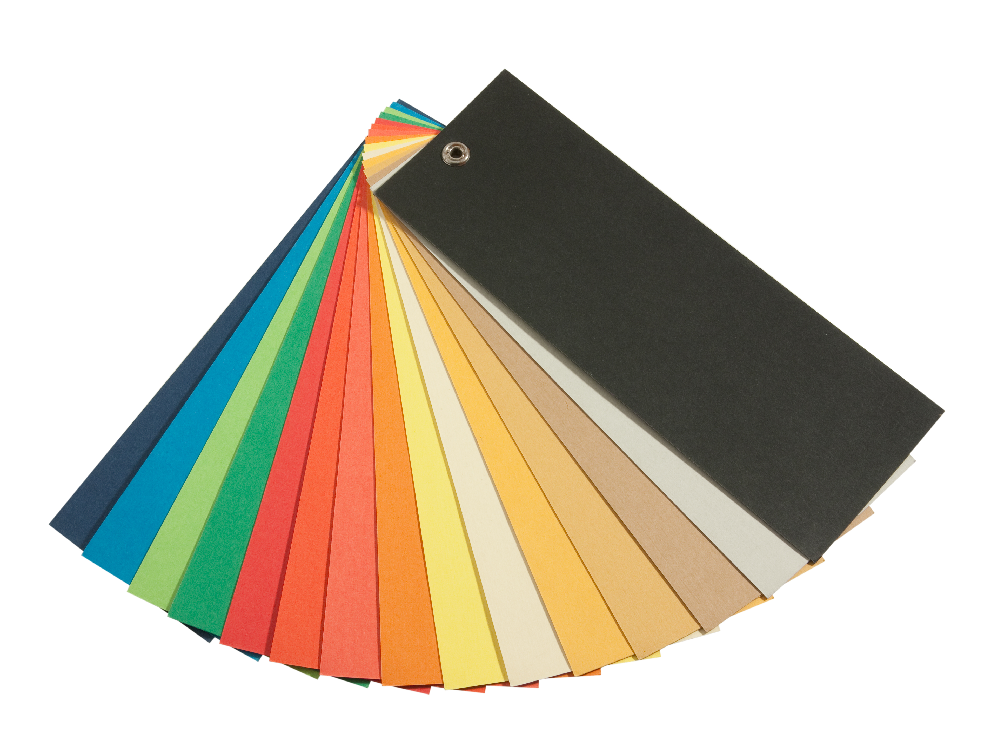
The Colour Is Different
 The primary colours have always been red, yellow and blue (this is according to what is taught in the elementary schools). When it comes to the printing world, it becomes a little different. The primary colours used in printers are cyan, magenta, yellow (CMYK) and black. Monitors, on the other hand, use the usual red, yellow and blue (RGB).
When you choose a colour for your brand on the monitor, it may be a little different when printed. Find more on why do printers use CMYK and not RGB? CMYK is used mostly in publications, advertising billboards, books, and biz cards. The blue, green and purple colour is differently presented in CMYK.
You might have chosen blue as your colour but when your printed document comes in it looks more of a purple than a blue. It is advisable before you send a colour print design to a publication you should check first how it looks in the CMYK.
Selecting the Right Colour
 When it comes to choosing a colour for your business brand it is vital you know what you want your brand to represent. You can select a colour that brings out the desired effect on the wrong customers because your brand colour communicates a different message.
According to the psychology of colours, emotions and behaviours can be influenced negatively or positively by the colour that is presented at a given moment. If you are going to choose a colour for your brand you should be able to answer questions like;
- Who is your ideal client?
- How does your product or service solve the client’s problems?
- Where does your ideal client like hanging out?
- Who are your competitors and what are they doing differently from what you offer?
When you can answer these questions, you’ll be able to choose the right colour that suits and attracts the right client to your business.
Ten Examples of Colours and What They Mean
Red
The colour red can mean a lot of things, but it will depend on what you want it to say. Red is passionate, aggressive, and on the negative side, it can portray violence, malice, and anger. The message you use on your logo will be explained more with the how you want the red colour to imply.
Blue
It is the colour of the sky and the ocean, and it resembles freedom. Most brand love using blue colour on their brand’s logo maybe to show there are no limitations in whatever service they offer. The blue colour tells you, ‘your secret is safe with me.’ This colour will depict how trustworthy a company is to be confidential in sensitive information.
Orange
It is a combination of aggressiveness and happiness. Orange colour shows that you are ready to go to the very end to achieve success without compromising integrity. During the autumn season leaves and some fruits such as pumpkin will change colour to orange, and this is why many people associate this colour with food.
If you are a restaurant owner, this colour might suit your brand identity well because the orange colour stimulates hunger.
Green
Green is always seen as the colour of the environment and nature. It depicts life and growth. When green is viewed as nature, it can be used to promote an environment-friendly product that is natural and not artificial.
Green has different shades, and each has a different meaning. It will depend on what message you want to put across while selecting one of the green tones.
Yellow
When the sunshine is out each beginning of the day, it brings joy with it, and this is the reason the yellow colour is related to the sun. Yellow can bring happiness, but on the other hand, it can also be irritating especially for men. Most men see yellow as childish, and when you are advertising a product with the yellow colour, it can be hard to sell to men.
If you are into children products, this could be the right colour to pick. Most countries in the world recommend all school buses be painted yellow. It becomes easier for most drivers to know the yellow painted bus is carrying children.
Grey
It is a neutral colour that can be associated with both sexes depending with the shades. Grey has been associated with loss and death in some cultures. This colour can be used when your brand is associated with conservative and sophisticated individuals.
Purple
The colour of royalty (as many love to call it), depicts power and wealth. It has the potential to bring out the imaginative and creative traits of a person. On the negative side when the purple colour is too much, it can evoke a feeling of moodiness.
While selecting as an identity brand colour, it is vital you understand and know what emotions it can bring out.
Pink
Pink is mostly seen as a feminine colour, and this is noted whenever someone is shopping for a girls clothing. When you look around a shop for children clothing, you will find more pink on girls’ clothing than any other colour.
Pink means friendship, love, harmony, and affection. Unlike the colour red, pink is calm and at the same time passionate.
Brown
The colour you see mostly during fall and winter. This colour shows the season is ending and it is time for a new start. The earth is brown, and for you to see it, you’ll have to harvest whatever is on the land.
It is a neutral colour that gives you a feeling of belonging. It shows you are connected with the earth one way or the other and gives you the comfort you deserve.
Gold
Wealth and riches have been associated with gold. It is a warm colour that is related to the colour yellow on the one hand and brown on the other side. It means it has some of the yellow and brown attributes combined.
Your brand identity can have one or multiple colours. You can blend colours depending on the message you want to communicate with prospective clients.
About the author:
Ryan Stevens is a print expert who enjoys sharing industry knowledge with print enthusiasts all over the web. As CEO of Replica Printing Inc, Ryan is involved with all major printing styles and options on a daily basis.
Leave a Reply